The autism spectrum as a spiky profile
There are many misconceptions based around autism: from us all being geniuses, socially awkward, unable to make eye contact to not wanting to connect with others – to name but a few. Then aside from these misconceptions, I find that there’s a general miseducation around the autism spectrum itself.

Often it’s assumed that it’s a linear line, with high functioning/mildly autistic at one of the line and low functioning/severely autistic at the other. It assumes that every autistic person fits neatly onto this static line, etched into its lineage, never to move again. This couldn’t be further from the truth and in reality, there is no beginning, middle or end of the spectrum. Plus using terms like ‘mildly autistic’ simply aren’t factually correct – nor helpful in any way – in that they don’t tell you how someone is impacted through being autistic.

Often it’s assumed that it’s a linear line, with high functioning/mildly autistic at one of the line and low functioning/severely autistic at the other. It assumes that every autistic person fits neatly onto this static line, etched into its lineage, never to move again. This couldn’t be further from the truth and in reality, there is no beginning, middle or end of the spectrum. Plus using terms like ‘mildly autistic’ simply aren’t factually correct – nor helpful in any way – in that they don’t tell you how someone is impacted through being autistic.
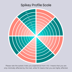
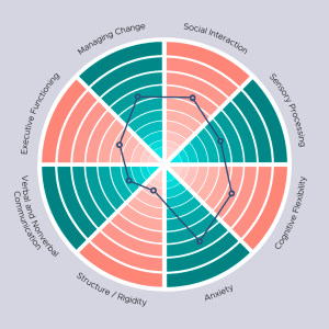
I really like to use the diagram on the right as I feel this helps visually highlight the reality of the ‘spiky profile’ and what this means. It has traits around the outside that depict what one may have support needs and challenges around, so for instance managing change and sensory processing. The scale runs from 0-10, with 0 (in the centre) depicting not being affected at all by the particular trait, to 10 (on the circumference) meaning being very affected. You then plot how impacted you are by each attribute, and this immediately shows where someone is especially struggling in that moment and helps identify what areas need concentrating on in terms of providing support.

What I really like about the diagram is its flexibility. You can add traits or reword them in a way that resonates best for you, plus you can fill it in as often as you like. You can use it as a proactive tool simply for yourself; to check in and quickly get a visual sense of what’s going on for you. This can help you reflect and figure out what you need, and then hopefully take steps to help move you forward. I find the visual representation to be very powerful.

In terms of the workplace, this can help your manager or team to know that you may perhaps prefer email contact to face-to-face meetings, or that you may not wish to join the next team social. Or potentially with increased levels of anxiety, you need more meetings to run over your work to check you’re on track. Everyone’s support needs are different and therefore so are the adjustments that someone may need. This is just one tool that can help guide those conversations and make it that bit easier to communicate your needs. So go ahead and create your own spiky profile diagram!
June 2022

